
.webp)
PERFORMANCE MONITORING • RUNTIME OPTIMIZATION RIDERSHIP ANALYTICS • ON-DEMAND TRANSIT ANALYSIS NETWORK OPTIMIZATION • APC/AVL DATA CLEANSING
KEY OUTCOMES
- Up to 20% OTP improvement, while adding and reducing runtime
- Brampton Transit added additional resources to address early-morning and and evening crowding in a targeted and cost-efficient way
- Time to investigate a crowding or reliability complaint reduced from 15-30 minutes to under 2 minutes
- Barrie Transit saw about a 14% ridership increase following the Phase 1 Implementation of their Transit Vision Network
TRANSIFY AS A ONE-STOP DATA PLATFORM
At Barrie Transit (50 buses), Transify has been in-use for over three years and has made their APC, CAD/AVL, On-Demand, and census data all ready to visualize in seconds. Each of these data sources has been fully integrated with Transify, making manual data extractions and uploads a relic of the past.
Transify's induced demand for more scheduling refinements due to the ease of pulling actual run time data. This leads to better run times matching actual conditions by hour to the benefit of the transit customer.” - Mike McConnell, Transit Projects Lead at Barrie Transit

OPTIMIZING RUNTIMES
At Brampton Transit (475 buses), schedulers have used Transify to develop more accurate runtimes. This improves customer experience by reducing service gaps and missed connections. Their new schedules have also addressed operator concerns related to schedule reliability and better reflect actual driving conditions.

"Our previous method of setting runtimes for scheduling was very tedious but Transify made it painless! Transify has allowed us to make more accurate schedules and add new timebands that we previously did not have the time to create. We saved over a week in updating our schedules while doing significantly more analysis!” - Robin Mennie, Transit Planner at Barrie Transit

RIDERSHIP ANALYTICS
With a Ridership Recovery of close to 130%, Brampton Transit is one of North America’s fastest growing transit agencies. With this rapid growth, Brampton had to be strategic about their resource allocation. Using Transify, service planners identified where:
- Additional trips could be inserted between over-capacity trips, which they scheduled by having some blocks start earlier in the day.
- Frequency in the shoulder periods could be optimized to improve midday service and early-morning capacity.


As part of their Transit Vision network plan, Barrie Transit is planning for more direct routes as to speed up travel times while maintaining coverage with on-demand service. Transify’s Hexagon Map below groups together stops as to help their planners identify which corridors are the busiest and where there is excess capacity.

OPTIMIZING THE EXISTING NETWORK
Transify’s maps make it easy to visualize productivity geospatially, with geographic maps that aggregate the total boardings and service hours within each census tract; any boundary file is supported - including TAZ, Postal Codes, and Hexagonal Bins.


IMPROVING SCHEDULE ADHERENCE
Transify is also proactively identifying trips that are not adhering to the schedule based on customized criteria. For instance, trips that started early or late without a reason (i.e. previous trip arrived on-time) are flagged, while the Real-Time Playback Map enables supervisors and customer service staff to investigate reports in a fraction of a time.

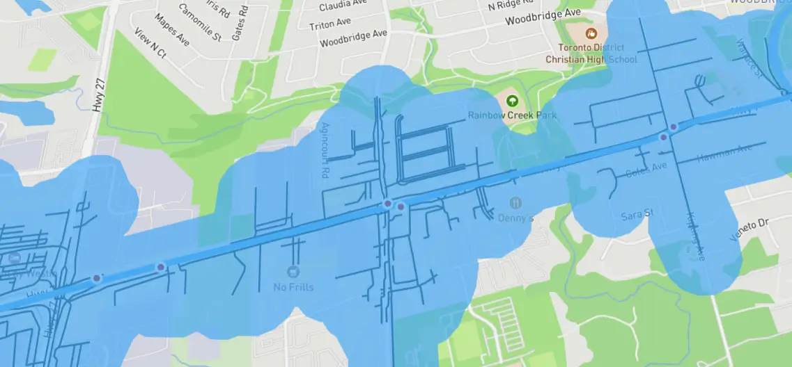
VISUALIZING COVERAGE & DEMOGRAPHICS
Visualize how even the smallest of stop placement changes can impact walking access to transit with granular and detailed service areas and pedestrian street networks. Includes demographic analysis from the Census, TTS, and custom shapefiles provided.
VISUALIZING ACCESS TO OPPORTUNITIES
Improving access to opportunities is a key component of Barrie’s Transit Vision, which is being visualized right in Transify. With Transify, Barrie Transit staff were able to visualize the impacts of frequency and coverage changes to access to jobs as they rapidly iterated through multiple concepts.

Demographic data can be generated instantly for any shaded area made in Transify. Census data is built-in from Statistics Canada, while additional data such as projections and employment activity can be loaded in to Transify for instant analysis.
SUCCESS WITH TRANSIFY
This case study showed how both Brampton Transit (475 buses) and Barrie Transit (50 buses) are using Transify to visualize their paths to better transit.
From improving reliability to designing a better network, Transify is there to help you transform your service with data you already have.


